IFS Cloud Web Lobby Page serve as a bridge between IFS Cloud Pages, Lobby Elements, and Data Sources. Within a
Lobby Page, you can find one or more Lobby Elements, each linked to a Data Source. However, there are exceptions to this
rule. For instance, the Links List element may be associated with multiple data sources, while the text/image element does
not rely on any data source.
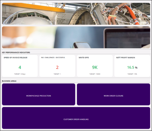
IFS Cloud Pages display data in a predefined format. Users can navigate to different pages within IFS Cloud or external websites
through links embedded in the Lobby Elements. Each Lobby Element can be configured to present the underlying data in various ways. However, it's important to note that Lobby Elements can only display data
available from their connected Data Source.
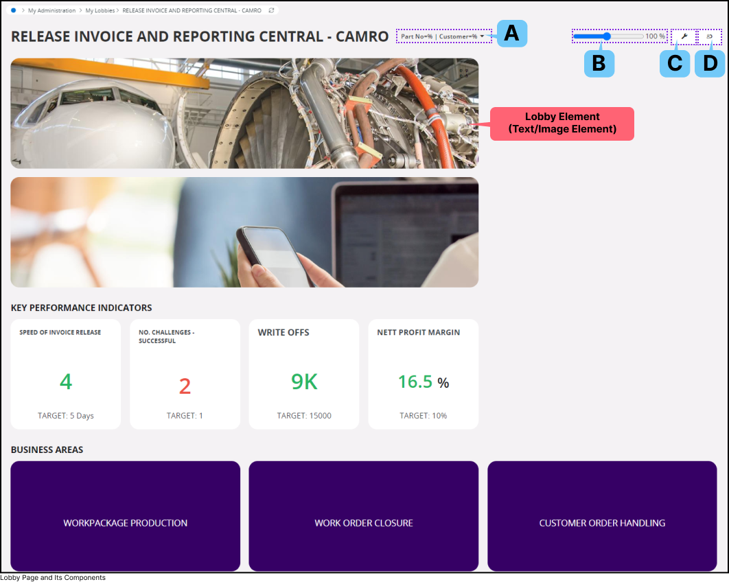
A.
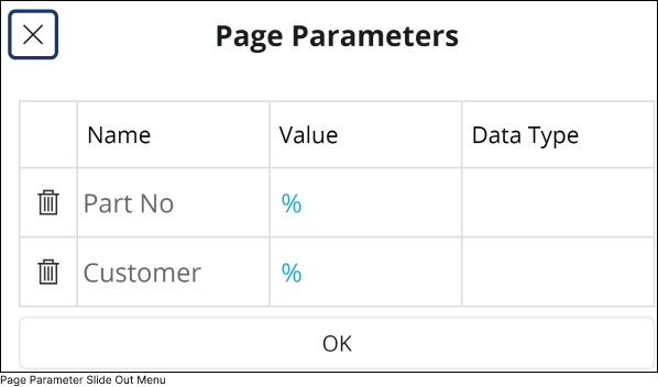
Page Parameters
Page parameters are used to configure data visualization within lobby elements. Admin users have the ability to set
up page parameters at the Data Source level. Once configured, these parameters are displayed as input fields within the Page Parameter
slide-out menu.
Click on the Page Parameter(A) icon to access Page Parameters slide out menu.
You can input a parameter value into the field and then click OK to trigger a refresh for all lobby elements dependent on the parameter.
This action ensures that the lobby element renders the data according to the parameter configuration.
B.
Zoom In / Out
Utilize the Zoom in/out(B) slider to adjust the zoom level of lobby elements within the boundaries of your screen size.
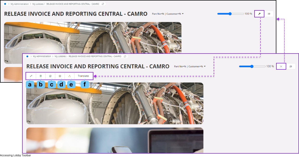
C.
Toggle Lobby Toolbar
Press the Toggle Lobby Toolbar(C) button to show/ hide lobby toolbar. lobby toolbar allows you to configure the
entire lobby page as per your requirement.
a.
Edit
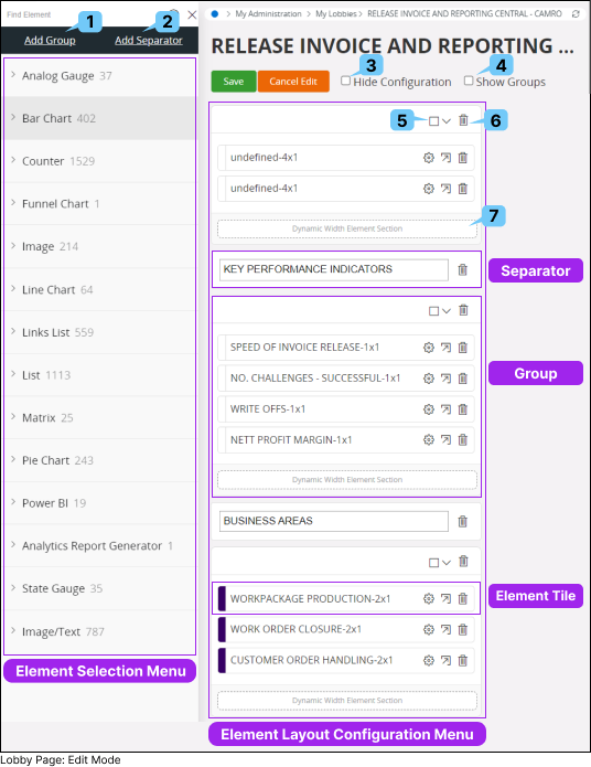
Click the Edit (a) button to access the lobby page layout editor. This interface enables you to add new elements,
rearrange the display order of existing lobby elements, and adjust the height or width of lobby elements as needed.
1.
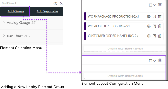
Add Group
In IFS Cloud Web Lobby Pages, you have the option to group elements based on your preferences within a lobby page.
This allows you to handle all elements within the group collectively. Grouping elements simplifies the management of the layout within a lobby page.
Once you create a new group you can:
Add new elements from the Element Selection Menu
2.
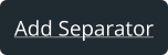
Add Separator
You can insert a separator between two lobby element groups by utilizing the Add Separatorbutton. Additionally,
you have the ability to include text with the separator, which will be presented as a title above the lobby element group on the lobby page.
3.
Hide Configuration
Hide the Element Layout Configuration Menu
4.
Hide Configuration
In edit mode, visually delineate the groups on the Lobby Page with grid lines.
5.
Display Options
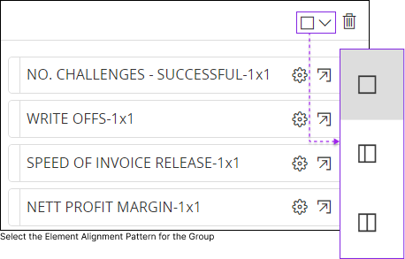
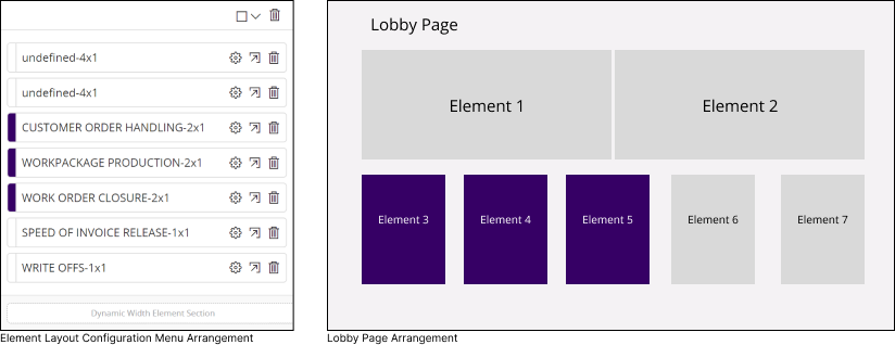
You can align lobby elements within a group according to one of three options shown in the Display Options drop down menu.
Option 1
Place all the lobby elements in a single row. If the width of the Lobby Page window is insufficient, the lobby elements will automatically move into a new row.
Option 2
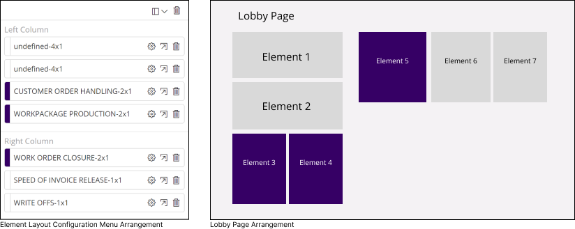
Divide the lobby page window into two columns known as Left Column and Right Column. The left side column is narrower, while the right side column is wider.
You can drag and drop element tiles from the Element Layout Configuration Menu and place them on either the left or right columns based on your preference.
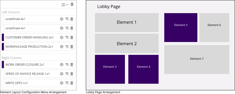
Option 3
Divide the lobby page window into two equal-sized columns known as Left Column and Right Columns.
You can drag and drop element tiles from the Element Layout Configuration Menu and place them on either the left or right columns based on your preference.
6.
Delete Group
Remove the Entire lobby element group from the lobby page
7.
Dynamic Width Element
Drag and drop an element tile into the Dynamic Width Element Section to dynamically adjust the element width as the screen size changes.
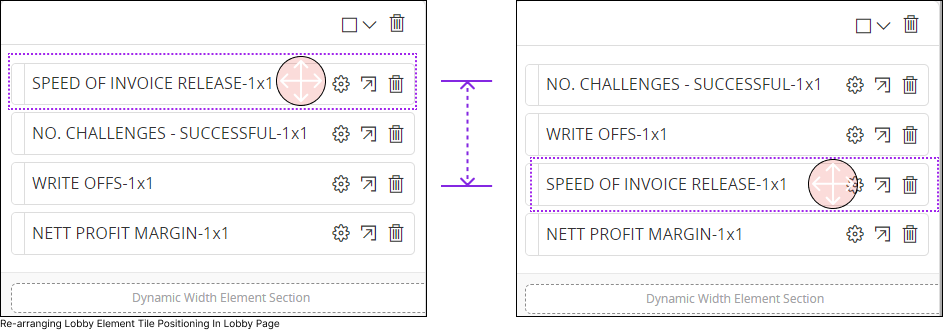
Re-arranging the Element
While in edit mode, hover your mouse cursor over any lobby element tile within the Element Layout Configuration Menu and your mouse cursor icon will change pointer to drag.
Left-click on any lobby element tile
Hold the left mouse button
Drag it to your preferred position
and then release the mouse button.
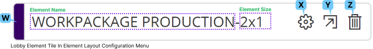
Element Tile
The Lobby Element Tile within the Element Layout Configuration Menu offers distinct features that enable you to configure the visual properties of a lobby element.
W : Lobby Element Background Color
This area showcases the background color of the lobby element. Only an admin user has the authority to determine the background color of a lobby element.
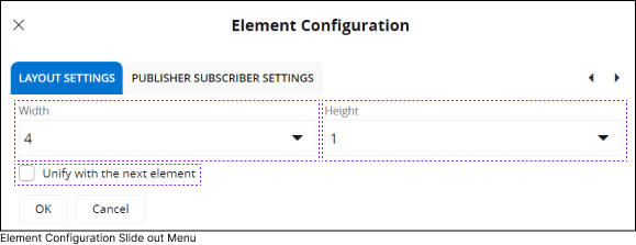
X : Element Configuration
Click on the Element Configuration (X) button to access the Element Configuration Slide out menu, where you can adjust the size of an element within the lobby page.
Width : Select a width for the element from the Width Drop Down Menu.
Height : Select a height for the element from the Height Drop Down Menu.
Unify with the next element : Select this option if you wish for the two lobby elements to be seamlessly connected without any space in between.
Y : Navigate to Element Designer
Click on this button to navigate to the Element Designer page. Please note that only admin users can access Element Designer Pages in IFS Cloud Web.
Z : Delete
Remove the element from the lobby page
b.
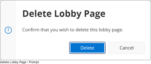
Delete
Click on the Delete(b) button if you wish to remove the lobby page.
This functionality is typically reserved for admins, but depending on your organization's policies, you may have the privilege to delete a
lobby page. After clicking the Delete(b) button, you will receive a prompt confirming your action to delete the lobby page. Select
Delete to authorize your action or Cancel to retract your decision.
c.
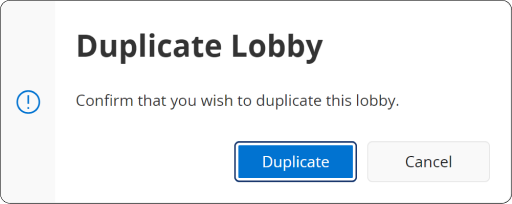
Duplicate
Click on the Duplicate(c) button if you wish to remove the lobby page.
This functionality is typically reserved for admins, but depending on your organization's policies, you may have the privilege to delete a
lobby page. After clicking the Duplicate(c) button, you will receive a prompt confirming your action to duplicate the lobby page. Select
Duplicate to authorize your action or Cancel to retract your decision.
d.
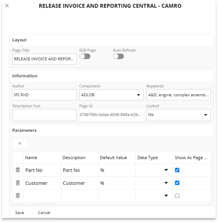
Page Properties
Click on the Page Properties(d) button to access the Lobby Page Properties Configuration slide-out menu.
This functionality is reserved for admin users and
it allows them to configure the layout of the lobby
page and add additional filtration options such as page parameters.
e.
Export Page
Click on the Export Page(e) button to export all the data visualized within the lobby elements to a .XML file.
f.
Translate Page
This is an administrative function that enables administrators to redefine the terms used within the lobby page
and translate them into different languages. If a user selects a default language from the system settings and the administrator has redefined
the terms in that selected language, then the displayed texts within the lobby page will be translated accordingly.
D.
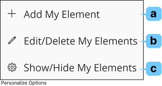
Personalize
If you want to create a personalized Lobby Element or edit the one you've created, simply click on the
Personalize (D) button, and follow the instructions given.
a.
Add My Element
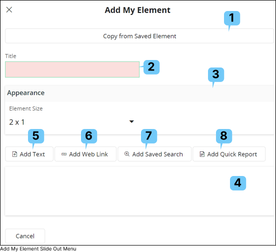
To create a new personalized Lobby Element, click on the Add My Element(a) button to open Add My Element slide out menu
1.
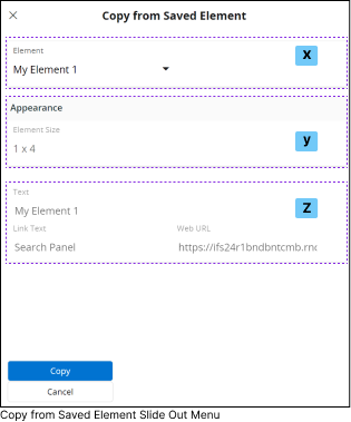
Copy From Saved Element
If you have previously created Custom Elements, you can select one of those Custom Element and modify its content to create a new custom
element using Copy from Saved Element(1) option.
Once you click on the Copy from Saved Element(1) button, it will open the Copy from Saved Element slide out menu.
Select the Element you wish to copy the content from, using the drop down menu in Element(x) section.
Appearance(y) section shows the selected custom element size
Final section(z) shows the properties within the Element
After selecting a custom element, click the
Copy button to add a copy of your previously created element to the
Add My Element slide-out menu for editing.
2.
Title
Provide a title for the Custom Element you are creating by adding relevant context to this field.
3.
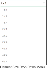
Appearance
Define the appearance for the Custom Element you are creating by utilizing the options in the Appearance section.
To define a size for the Element, click the Element Size drop-down menu and select any of the available size options.
4.
Element Content
Element Content(4) section consists of all the content you have added to the Custom Element using options (5),(6),(7), (8).
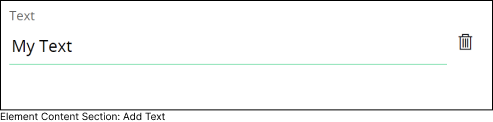
5.
Add Text
Use this option to add text for the Custom Element. Upon selecting this option, a new entry will appear in the
Element Content(4) section as demonstrated below.
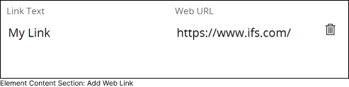
6.
Add Web Link
Use this option to add link for the Custom Element. Upon selecting this option,
a new entry will appear in the Element Content(4) section as demonstrated below.
7.
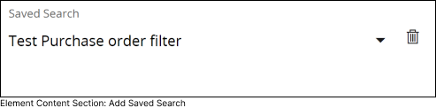
Add Saved Search
Utilize this option to add a saved search for the Custom Element. Upon selecting this option,
a new entry will appear in the Element Content (4) as shown below. This entry includes a drop-down menu
where you can select a saved search from the list. All your saved searches will be available in the drop-down menu.
8.
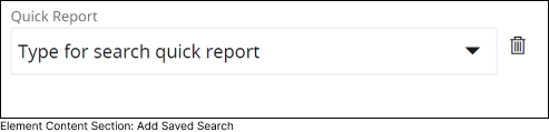
Add Quick Report
Utilize this option to add a generated report for the Custom Element. Upon selecting this option, a new entry will appear in the Element Content (4)
as shown below. This entry includes a drop-down menu where you can select a quick report from the list. All your generated quick reports will be available in the drop-down menu.
b.
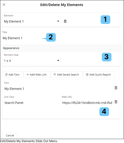
Edit/Delete My Elements
To modify any Custom Element you have create, click on the Edit/Delete My Elements(a) button.
This will open Edit/Delete My Elements slide out menu
1.
Element Selection
The Element Selection (1) section comprises a drop-down menu containing all the custom elements you have created over time.
By default, the most recently created element will be selected in this drop down. Choose any custom element from the drop down menu to modify it.
Click the Delete button next to the Custom Element selection drop-down to delete the selected Custom Element.
2.
Title
Modify the title of the Custom Element you have selected by adding relevant context to this field.
3.
Appearance
Modify the appearance of the Custom Element you have selected by utilizing the options in the Appearance section.
To modify the size of the Element, click the Element Size dropdown menu and select any of the available size options.
4.
Element Content
Modify any of the content within Element Content(4) section as per your requirement.
Once you have made any modifications to the Custom Element, a Save button will appear for you to save the changes you have made.
c.
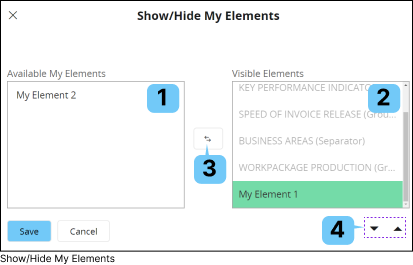
Show / Hide My Elements
If you wish to show/hide any Custom Elements you have created, you can use the Show/Hide My Elements(c) option.
1.
Available My Elements
This section comprises all the Custom Elements created by you that have not been used in the current Lobby Page.
If you wish to hide any Custom Lobby element, you should move it to the Available My Elements(1) section.
2.
Visible Elements
This section includes all the Elements/Custom Elements that are currently used in the Lobby Page.
If you wish to make any Custom Lobby element visible, you should move it to the Visible Elements (2) section.
3.
Visible Elements
To move a Custom Element from the Available My Elements(1) section to the Visible Elements(2) section or vice versa,
select the Custom Element within any section, and then press the Move(3) button to transfer it to the other section.
4.
Move Up/Down
To change the display order of the Custom Element within the Lobby page use the
Move Up/Down button(4).